[ UX/UI ]
UX/UI errors that lower the conversion of a website
A website loses conversions when it forces you to interpret the offer, hides the test, multiplies decisions or makes it difficult to complete the task from a mobile phone.
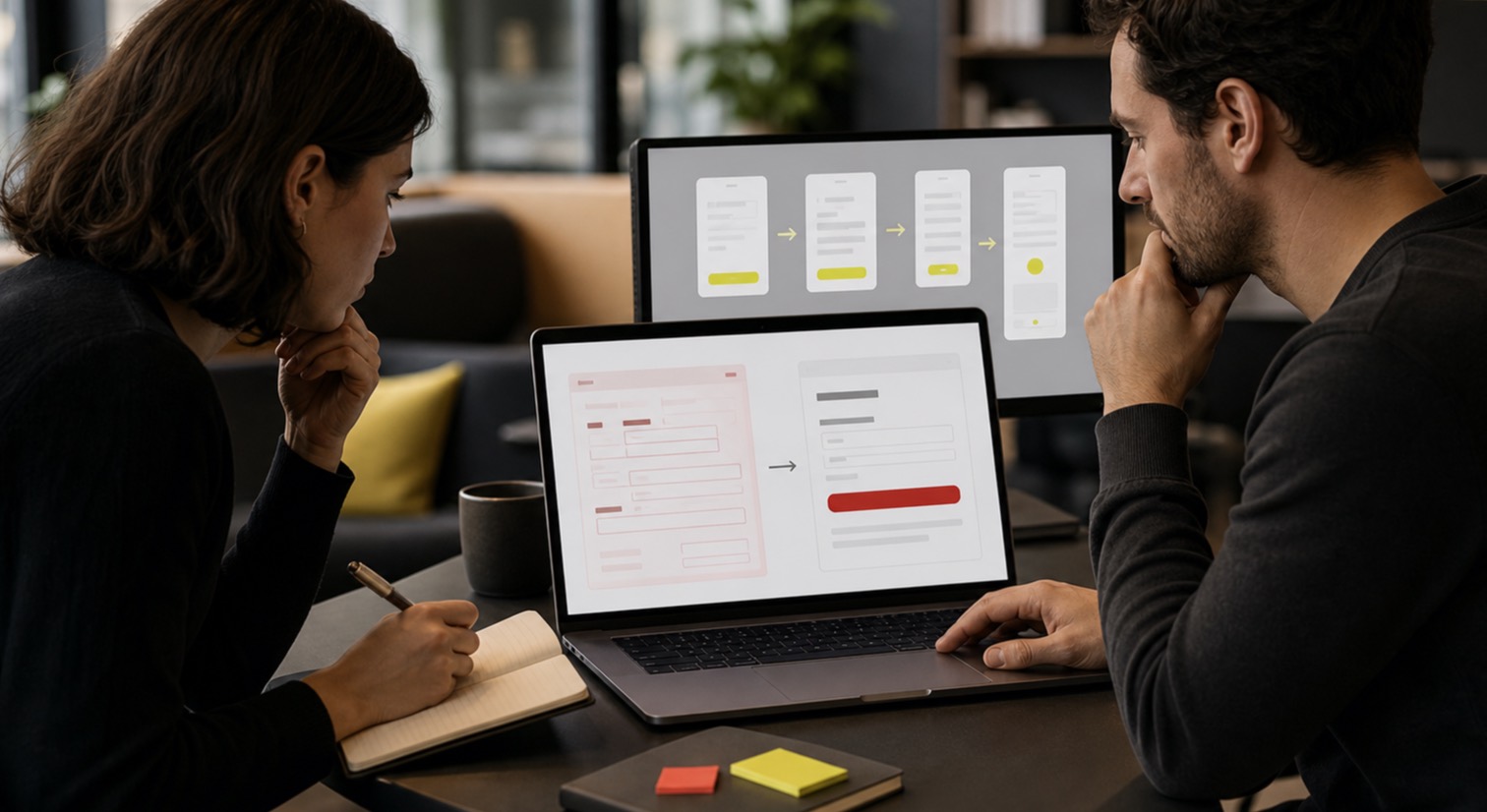
The UX/UI errors that hurt conversion the most are usually structural: ambiguous proposal, unprioritized content, premature CTA, confusing navigation, forms without context and incomplete states. Correcting them requires observing the entire route, not retouching isolated elements.
[01] Message
The proposal takes too long to understand
Abstract headlines, jargon, and animations without a concrete answer increase cognitive load. The person should know what the page offers, for whom and what the next step is before exploring the detail.
[02] Hierarchy
Everything competes for the same attention
- Several primary CTAs with different objectives.
- Blocks that are visually the same although they do not have the same importance.
- Evidence and objections away from the corresponding decision.
- Navigation that prioritizes the internal structure over the user's task.
[03] Friction
The form asks for more trust than it has built
Asking for phone number, quote and details without explaining the answer, privacy or usefulness can stop a request. Each field must justify the effort and errors must indicate how to correct them along with the affected control.
[04] Responsive
Mobile loses content or control
Menus that are difficult to close, small touch targets, clipped text, overflowing tables, and elements that change position degrade the task. Responsive means retaining function and priority, not shrinking the desktop.
[05] Validation
The interface is changed without measuring the problem
Combines analytics, recordings, errors, internal searches, business feedback and task testing. Data tells where to look; The analysis explains why it happens and what hypothesis deserves an iteration.
[FAQ] Questions
Preguntas
- Which UX error should be corrected first?
- The one that blocks a valuable task and affects more users: understanding the offer, browsing, submitting the form, purchasing or using the product from a mobile phone.
- Does a bigger CTA convert better?
- Only if it was difficult to find or use. Without context, clarity and trust, increasing the size does not solve the reason why the person does not act.
Next step
If this fits your project, let's review the scope.
The article prepares the decision. The service brings that decision down to real architecture, design, and deliverables.
Review website conversion