[Success story]
Aqlick
Digital and promotional marketing agency with comprehensive Contact Center and logistics services.
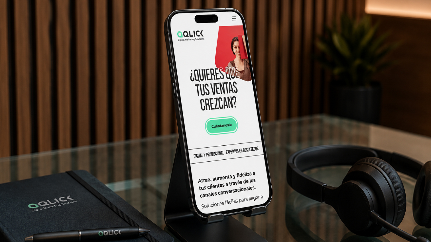
Development of the Aqlick project
Aqlick is a company specialized in digital marketing, promotional campaigns, and global Contact Center and logistics solutions for consumer brands. Its purpose is to design, implement, and manage conversational flows (such as WhatsApp automation), giveaways, and incentive delivery, transforming customer interaction into a close, agile, and high-impact experience. For a digitally native brand operating at the intersection of consumer technology and real operational management, the visual identity had to immediately project three pillars: agility of execution (a concept implicit in its own name), operational reliability, and closeness.
For this case study, our participation focused exclusively on the development of its Comprehensive Branding. We led the conceptualization and art direction phase to create a clean, symmetrical, and highly readable logo, optimized for digital and print environments. Subsequently, we structured its corporate identity manual, defining a normative visual system that ranges from a high-energy color palette to typography and secondary graphic resources. The result is a mature brand universe that provides Aqlick with the visual authority necessary to connect with marketing directors and decision-makers in growing companies.
-
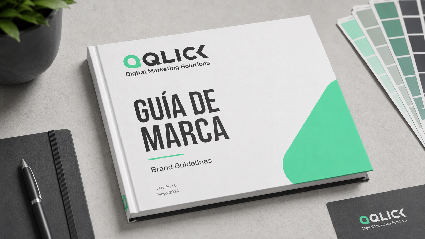
Application 01 of the Aqlick project. -
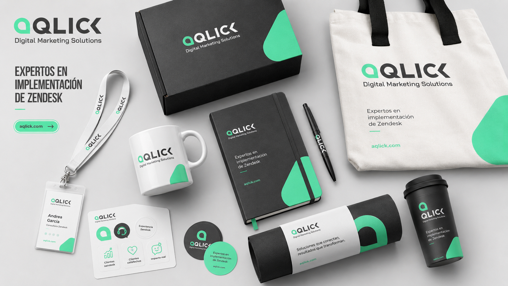
Application 02 of the Aqlick project. -
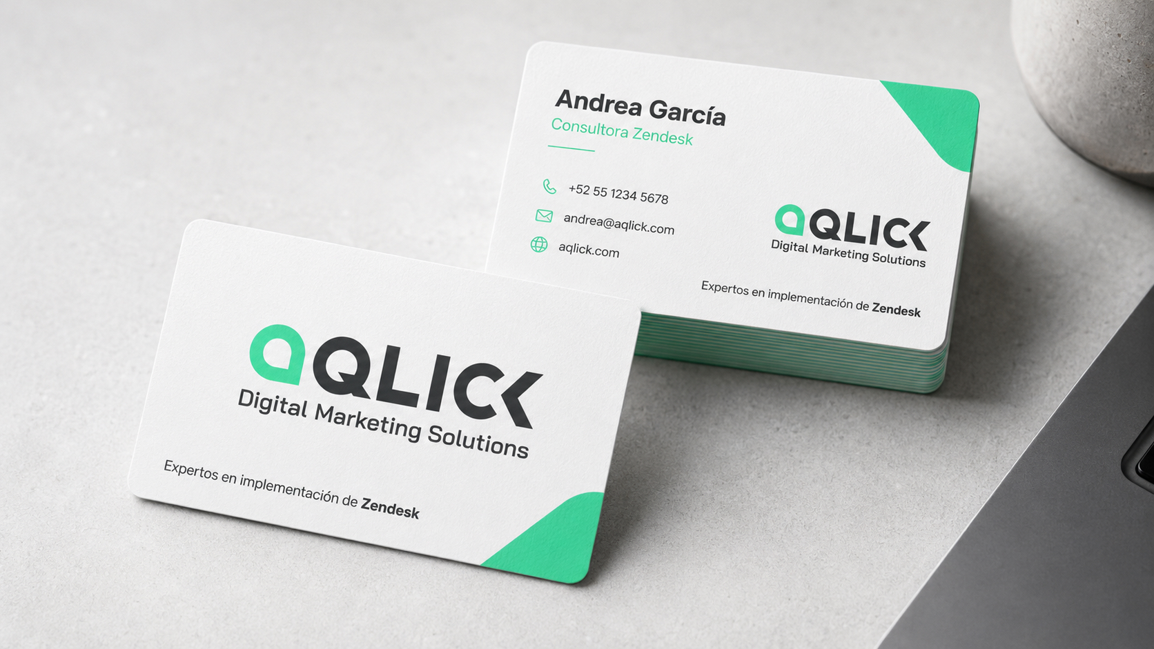
Application 03 of the Aqlick project. -
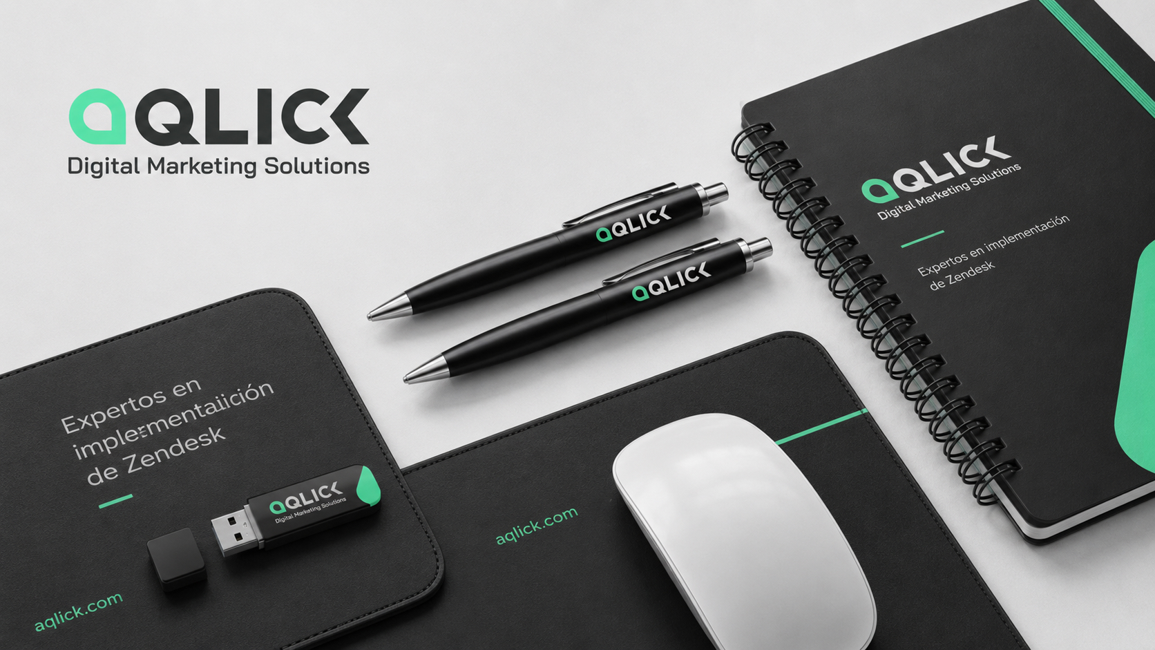
Application 04 of the Aqlick project. -
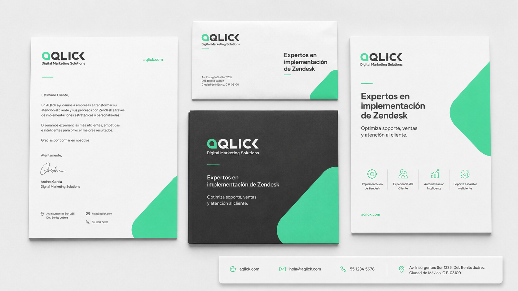
Application 05 of the Aqlick project. -
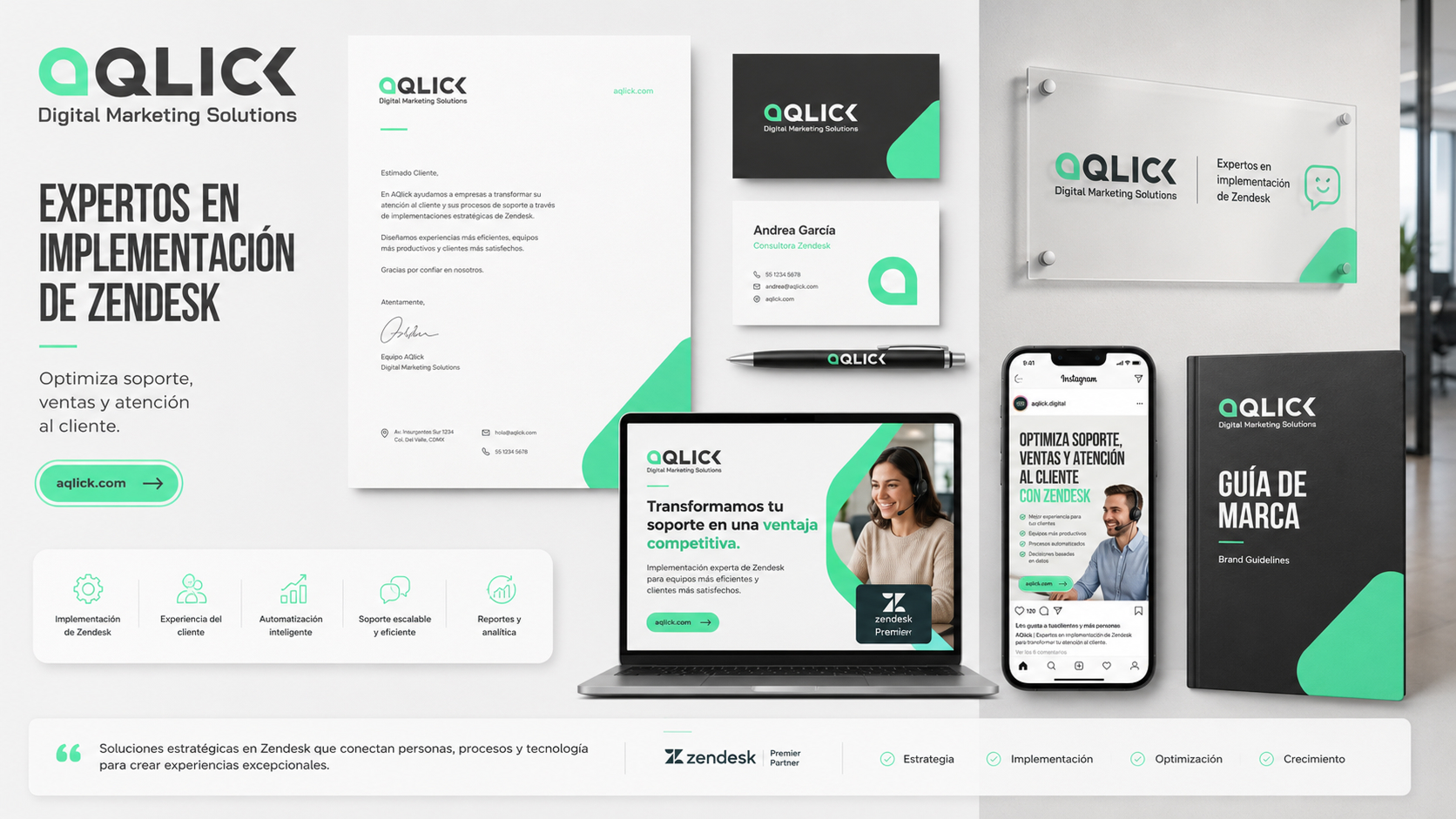
Application 06 of the Aqlick project. -
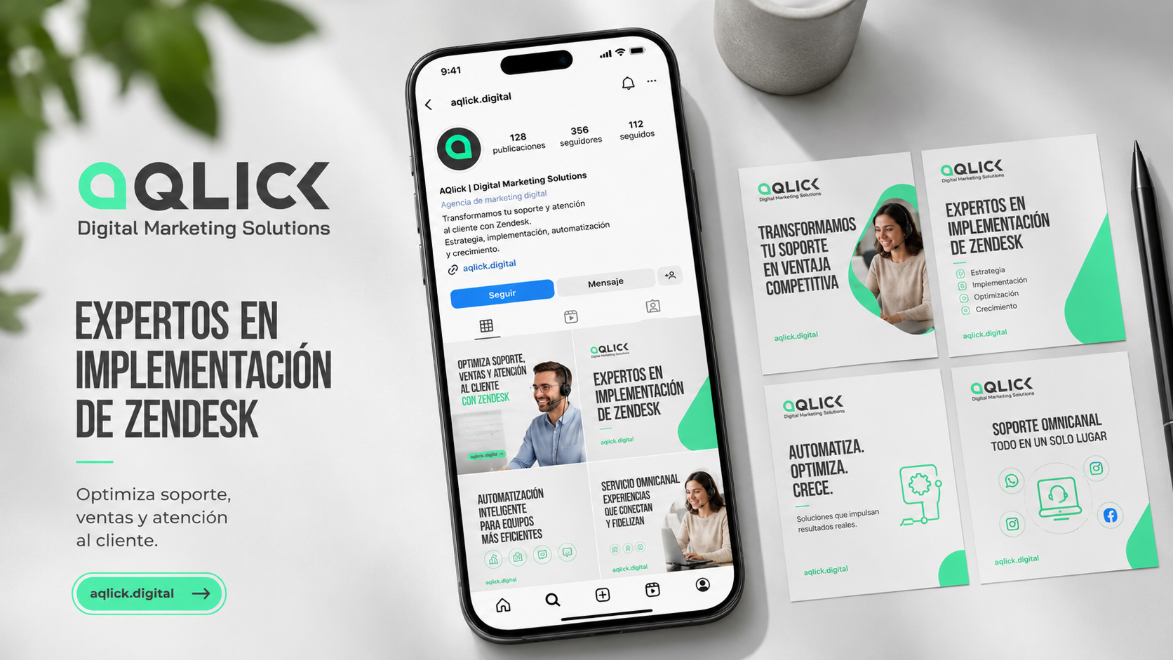
Application 07 of the Aqlick project. -
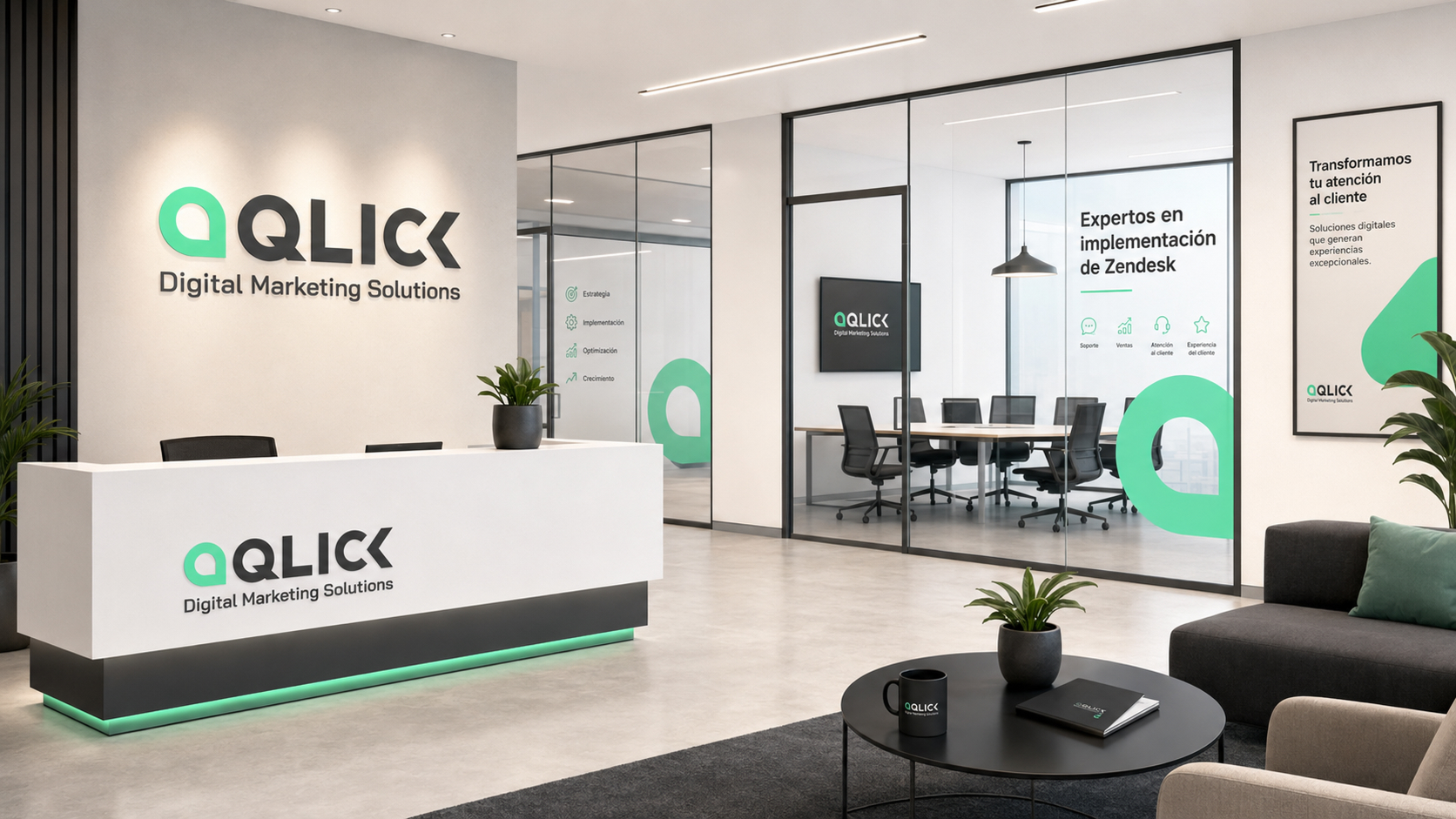
Application 08 of the Aqlick project.
Services worked
- Branding
Do you want to build a project with this level of criteria?
Tell us what you need and we will tell you what phases, deliverables and scope They make sense for your case.
I want a similar project